
According to Forbes, the intensity of competition has made it necessary for businesses to make an extra effort to stand out in the crowd. One of the most effective ways of getting your business or brand logo noticed more by the target audience present at the event and through media coverage is by using a step and repeat banner that serves as a backdrop for participants, celebrities, and guests to pose for photographs. However, for the brand to receive prominent coverage, the step and repeat banner design has to be right. Some tips:
Get the Banner Size Right
You can design and print step and repeat banners in many sizes. However, you must be sure that the size is correct so that the banner extends adequately on both the sides and the top of the people taking their photos against it. As a rule of thumb, making the height of the banner eight feet is good enough to provide space above the heads of the people standing or sitting in front. Deciding on the width is trickier because you will have to know how many people at a time are going to pose for photographs.
Get the Logo Size Right
Getting the size of the company or brand logo is critical for visibility on a custom step and repeat banner. If you make the brand logos too small, they will not be visible to the audience or in the photos, but if you make them too large, they are likely to get obscured or chopped off. Ideally, the size of the logos should be such that they are easily visible by the people present and in the photographs or video coverage. The size of the logo also depends on how intricate their design is, as making them too small will make them illegible. Another factor in the logo sizing issue is the distance from which the photographers will shoot the photos. The further they stand, the larger the logos will need to be.
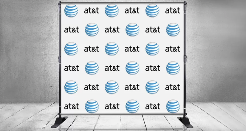
Get the Spacing Right
The spacing between two logos is also critical in ensuring visibility. If you try to fit in too many logos without leaving adequate space between them, the banners can look busy, and the logos will blend, making it difficult for people to decipher them as individual logos. On the other hand, leaving too much space between the logos can mean leaving too much blank space around the people in the photos and reducing the changes of the entire logo unit becoming visible in the photos. The ideal effect is the logos should be easily distinguishable from a distance, and the full logos should be visible.
Conclusion
In addition to the tips mentioned above, some other things to keep in mind are the need to use high-resolution images of the log to prevent the print from looking blurry and choosing a high-contrast background color to ensure that the logos pop. When using logos in many colors, a neutral-colored background is optimal. You should also print the banner using a matte material to avoid spoiling the pictures due to the glare of the lights and camera flashes reflecting off the banner.